
Between the old school AD&D Monster Manual with amateurish cartoon drawings and the latest one with glistening 3-D-looking fangs in living color, Moomin chose the older book. I thought about why and realized that the design in D&D looks too grown up.
Compare the covers. Here’s the 1977 version:
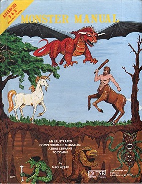
It’s cartoony, childish, stylized, and shows a range of nifty magical creatures, some scarier and some, like the unicorn, benign or friendly.
Here’s the new one:

It’s… a door with an eyeball in it?
Inside the images are sort of glitzy and porntastic and make you think more of something in a horror movie than a game. They’re scary!
It seems worth pointing out. The audience for the original game grew up, the game’s being marketed to them or to 20 year olds, and the elementary school kids are left out of consideration of the books’ art and systems.
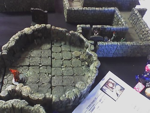
This while the miniatures and the idea of the game itself remain excellent for kids!
6 Responses to D&D grows up too much